Search site
Contact
Marie-Josée J.Fleming
E-mail: mj.fleming@hotmail.com
Typography Tips
In typography tips you can find many ways of making simple words into art.
10 Typography Tips to Bring your Skills to the Next Level

An often overlooked aspect of web design, by those just starting out, is typography. In fact, web designers that have been around for a couple years even have a tendency to overlook and undervalue the power of typography. Don’t be mistaken though, it’s one of the most powerful tools web designers have.
In this article, we’ll review ten web typography tips that will bring your typographic design skills to the next level.
1. Leading
Leading is the space between lines of text and probably one of the more commonly known elements of typography. Leading will greatly effect the readability of your text content. Leading will need to be changed based on the type face, size, weight and measure (covered next) used.
I generally stick with about 2-5pt’s larger leading than font size depending on the type face, size, etc. and how it feels reading it.

2. Measure
Measure seems to be overlooked quite often in many of the templates I review. Sometimes I forget about it too though which is why articles like these are always a nice refresher.
Measure is the width of your text. If it’s too wide then it makes it harder for readers to visually travel from one line to the next. If it’s too narrow then it will be too much eye movement from one line to the next.
This will be a little harder to show you at a normal font size so I’ve reduced the font sizes for the example below. I see this issue most commonly with templates that have really wide content columns.

I’ve heard different ways of approximating the appropriate width for text measure such as multiply the font size by 30 to get pixel width (10px font size X 30 = 300px measure width) or using approximately 80 characters as a max width. I like to read a test paragraph and adjust as necessary until it feels right.
3. Text Alignment
On the web it’s not a good idea to use justified text alignment. It will space out the words awkwardly and make it more difficult to read. Yes, the left and the right sides will be flush but readability is more important.
In the example below you can see it doesn’t look terrible but you’ll notice the first line is much more crammed together than line two and three. The test text and Photoshop didn’t provide an ideal example but when you’re dealing with more real world text in a browser, things can get pretty ugly with justified text alignment.

4. Create a Strong Hierarchy
Creating a strong visual hierarchy is very important for readers to be able to quickly navigate from most important content to least important and gives them a sort of scaffolding to quickly find specific content they’re looking for. It gives a design structure and a logical flow of presented information making it feel more inviting for visitors.
Visual hierarchy using typography largely depends on size, color and spacing. The example below (Pacifica Theme Forest template) uses large, bold headings for primary content (left column) and smaller headings for secondary content (right column). Less important text content uses a lighter color and/or lighter weight.
For more information on visual hierarchy, read “Visual Hierarchy in Web Design“.
5. Serif and Sans Serif
If you’re less experienced with typography in design, it’s a much safer bet to use serif fonts for headings and sans serif fonts for body text. If you’re not sure what a serif is, see “Serif” via Wikipedia.
Serif fonts at smaller sizes don’t display well and can make body text uncomfortable to read. Using sans serif fonts for headings is fine too, it will just be a little less attention grabbing and will depend on your design. The example below (minimo Theme Forest template) is a great example of custom serif font headings and sans serif font body text.
This example (Atlantica Theme Forest template) uses serif fonts for both headings and body text. The body text size is probably a little too small for being a serif font but it still looks nice and can obviously be increased by buyers. This is a great example of using all serif fonts in a template.
6. Plan For Font Size Increase
Those of us with great vision often forget about those with not-so-great vision. As a result, we forget to ensure our templates will scale properly with font size increases. If you style your typography correctly and create a solid layout, this won’t be an issue.
Example: A List Apart – Default font size.

Increased font size two levels in Safari.

As you can see, it scales nicely without breaking anything and without headings with overlapping line-heights, etc.
7. Start Using Styled Quotation and Apostrophe Marks
Instead of using straight, boring quotation and apostrophe marks like this.
“It’s boring”
Use the prettier, styled quotation marks like this.
“It’s sexy!”
- Left quotation is “
- Right quotation is ”
- Apostrophe is ’
I have to break myself of this habit as well. ![]()
8. Use a Baseline Grid
Grids aren’t just for structural layouts you know. Establishing consistent typographic vertical spacing helps keep the page balanced and proportional throughout your template. (Image via A List Apart)

For more information on this, read “Setting Type on the Web to a Baseline Grid“.
9. Limit Your Font Faces
Don’t use more than three font faces in your design and preferably stick with two. With two font faces you can create plenty of variations to fill your needs. If three are needed, use the third sparingly so you don’t add confusion to your design.
It’s also a good idea to limit font sizes and colors to minimize reader confusion and keep consistency.

Now that I’ve said that, once you’re experienced enough, you can break this rule. It takes skill and practice to do it right though so if you’re not already a font expert, I’d stick with this rule for your production work.
10. Use “Whitespace” Appropriately
“Whitespace” (aka negative space) is the space between elements like bodies of text, columns, etc. This can be broken down to the smaller elements as well.
I’ve placed red in just some of the areas utilizing whitespace in Theme Forest’s blog design. You’ll notice the whitespace is balanced nicely throughout the page.

Giving your website elements enough whitespace is important and very helpful in creating a well balanced design. Be careful that you don’t over do it though because too much whitespace use the wrong way can be just as bad as too little.
For more information on whitespace, read “Whitespace” via A List Apart.
Conclusion
There’s a lot that goes into typography and it can make or break a design. If you’re not that familiar with typography or other ways it is used in web design, it would be very beneficial to take some time to dig deeper and learn more of the ins and outs.
Typography is an art and skill that takes time to master, but as I said at the beginning, it’s one of the most powerful (if no the most) tools designers have.
Five simple steps to better typography

Typography, I find, is still a bit of mystery to a lot of designers. The kind of typography I’m talking about is not your typical “What font should I use” typography but rather your “knowing your hanging punctuation from your em-dash” typography. Call me a little bit purist but this bothers me.
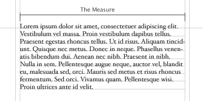
So, in an attempt to spread the word here’s the first of five simple steps to better typography. To kick it off, part one is about the Measure.
Measure the Measure.

The Measure is the name given to the width of a body of type. There are several units of measurement used for defining the Measure’s width. The three basic units are:
- One point = 1/72 of an inch
- One pica = 12 points
- One em = The distance horizontally equal to the type size, in points, you are using. Eg. 1em of 12pt type is 12pt. (Thanks to Joe for correcting me on this.)
But, with the advent of DTP packages and the website design the following are also now used:
- Millimetres
- Pixels
There is an optimum width for a Measure and that is defined by the amount of characters are in the line. A general good rule of thumb is 2–3 alphabets in length, or 52–78 characters (including spaces). This is for legibility purposes. Keep your Measure within these guidelines and you should have no problem with legibility. Please note that this figure will vary widely with research, this is just the figure I use and it seems to work well as a generally rule of thumb.
CSS and fluid?
What is interesting here is fluid designs on the web. How can a Measure react to an increase and decrease in size. The entire grid would have to adapt to that change. An interesting discussion point and challenge.
The Measure and leading.
A simple rule is your leading should be wider than your word spacing. This is because when the balance is correct, your eye will move along the line instead of down the lines.
If your measure is wider than the guidelines for optimum legibility then increase the leading, or line-height as it’s sometimes wrongly called. This will have the effect of increasing legibility. Your leading should increase proportionally to your Measure. Small Measure, less leading. Wide Measure, more leading. It’s a simple but effective rule.
Reversing out?

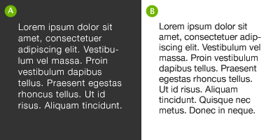
When reversing colour out, eg white text on black, make sure you increase the leading, tracking and decrease your font-weight. This applies to all widths of Measure. White text on a black background is a higher contrast to the opposite, so the letterforms need to be wider apart, lighter in weight and have more space between the lines.
Tracking
![]()
The general rule of thumb in tracking your words (not the characters) is that the shorter the line length the tighter the tracking, the opposite is also true.
Your responsibility
Following these simple rules will ensure your bodies of text will be as legible as they can be. These rules come from a typographic craft background which unfortunately, for our industry in particular, aren’t being taught as much as they should be in the art schools around the world. As a result they aren’t being practiced and correct, well-considered typography is taking a nose-dive.
It’s our responsibility, as designers, to embrace the rules which are born of a craft which goes back hundreds of years.
Hopefully, this series of quick, sure-fire ways of improving your typographic craft will help in some way make sure computers and DTP doesn’t kill it off. That would be a great shame.
The series
This is the first installment of this “Simple Steps…” series. Next up we have Hanging punctuation
- Measure the measure
- Hanging punctuation
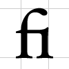
- Ligatures
- Typographic Hierarchy — size
- Typographic Hierarchy — weight
© 2010 All rights reserved.


